Wednesday, 14 September 2016

3 SONG CHOICES

During today's session we had to make our first group decision which was narrowing down our 12 individual ideas and song choices to three songs and basic concepts we will continue working with.
After a long discussion we agreed on three songs that we want to develop further.

These three songs are:
1. Glory Box, by Portishead
2. If I ever feel better by Pheonix
3. Hurt me, by LÃ¥psley

Glory Box
The song was published in 1995, by the bristol based band Portishead. The group formed in 1991 and ever since produced music of the Trip-Hop and experimental rock genres.
(This song was originally suggested from Thomas)

If I ever feel better
'If I ever feel better' is a catchy Indie pop tune that was published in 2000 by the French band 'Pheonix'. The band formed in 1999, by Thomas Mars, Deck d'Arcy, Laurent Brancowitz and Christian Mazzalai. The artists are classified as a Rock band.
(This song was originally suggested from Thomas)

Hurt me

The electronic/ dance song was released in 2016, on the album 'Long Way Home' by the British artist LÃ¥psley. 
(This is one of my original songs, however we found that Honor and I had similar ideas that we are planning to combine during the development stages)
Read More

Tuesday, 13 September 2016

Research in the UK music market

  • 2.1 million LPs purchased as vinyl sales climb 64 per cent to 21-year high, while decline in CD slows to 3.9 per cent as format still accounts for two thirds (66 per cent) of all album sales (excluding streams). 
  • Ed Sheeran is the most streamed artist in 2015.
  • Adele dominated the Official Charts with seven of the top-10 best-selling artist albums recorded by a home grown act in 2015 and 15 of the top 20
  • Compilation albums remain popular with fans and commercially important to the industry, and the year’s best-seller – Now That’s What I Call Music 92 was the fifth most purchased album of the year overall, with over 800,000 copies sold.
Read More

Saturday, 10 September 2016

Getting into groups

During todays class we decided on our groups, that we will be working on our advanced portfolio with. I wil be working with Jema, Honor and Toma. 
  

We deided to form a group because we liked eachothers initial ideas and song choices, also we all want to cerate a more alternative and narrative based music viedo.

As a group we will be working as a small production company and produce a pop music video, a CD digipack and a website promoting an artist. We will complete the production of the campaign in December. 
1.Pop Music video
This is an example of one of last years A2 work. We will also create a pop video of maximum 3 minutes.

I read a few articles on the production of music videos and I found this article very helpful.


2. CD digipack

3.Website
We won't simply produce a homepage for an artist, but we will create a full website. This website needs to represent the artists image and fit in with the promotion style.


Read More

Wednesday, 7 September 2016

Luke's introduction


During today's lesson Luke came to give us a brief of what we can expect from the upcoming weeks and what expectations are held towards us. He gave us a rough outline of the production process and provided us with a series of tips and research material. 

The upcoming Months:
  • Next week we will start pitching our ideas.
  • WE will work on our artist's presentation. Creating the website will help develop the style.
  • We will then start securing locations, working with an art director and a lighting designer. 
  • By half-term we should be ready to go
  • In November we will then start shooting.
  • Shooting music videos, normally happens within one day. We will shoot in studio in the morning and on location in the afternoon.
  • After shooting we will go straight into editing.
Luke's Tips:


As an example of thinking outside the box luke showed us the narrative based music video to Breeze box.
  • The video represents the melody visually without an actual performance element. E.G. when the music 'drops' the characters fall down. 
  • The music video is interesting due to its editing technique, which reveals its true narrative only in the end.
  • Also, it doesn't forcefully try to represent the song. The director selected a single element from the lyrics the 'breeze box' and used this as a starting element of the music video to link the two medias.
Luke also introduced us to the website Radar.

Radar Music Videos is a music video commissioning company, that cooperates with more than 10,000 music video directors worldwide. The website allows labels, artists and managers to commission music videos from new director talent. The website can be of use to us, to gain inspiration from or find upcoming artists. 
He also showed us a text published on Radar in 2013 about the 'Rise of the Video', by Caroline Bottomley. THis allowes us to build a better understanding of the music industry and pop promos. 
Read More

Tuesday, 6 September 2016

Slippery Slope


This is a visual description of my AS Media journey:

  • The waterfall on the left of the picture represents the hard start of the year. It was hard getting settled in. 
  • The cocktail and the palm tree represents the fun and success of the production work.
  • The clouds represent the struggle of the exams, combined with a stroke of light since the teaching was still interesting.
Read More

Friday, 2 September 2016

LÃ…PSLEY/campaign

Since LÃ¥psley is a solo artist, I had a clear image of her album cover in mind early on. I wanted to use the flowers from the video as a visual link throughout the campaign. Also having her as the point of focus again supports the image and brand she is selling. 

I imagined a portrait of the artist lying in a bed of roses. To visualise my idea I created this very rough example.

As I worked on the previous cover, I also created a second version which has a more vintage feel to it and doesn't feel as manufactured, simply by the small choice of adding a border and therefor making it less dominant.
(This is a rough layout for the digipack's backside, which I brainstormed)


These are other 
inspiration pictures for my idea:


In before hand I looked at other solo artists album covers and I could also imagine a similar look to these albums:  
Another option for the album artwork of LÃ¥psley could be a portrait of her with falling rose petals. This is a similar album cover that I found online:


Although this is visually relation, I love the idea of photographing someone in milky water or perhaps filming them. I think it gives a super interesting and modern look, since it creates the illusion of certain body parts just floating. I would love to incorporate or suggest this as a technique throughout the group work process.

Website

For LÃ¥psleys website I imagine a simple look, with large sized photograps of her. I would like to incoroperate the colour red, to create a visual link between the albumcover, the music video and the website. This is conveyed through the red roses. Also the red colour scheme connotes the artist to be attractive, which suports her image.

In tearms of layout I could imagine something like the website of 'The Rise', in adition the background could be of a milky colour with rose pattels falling down, or pehaps we could expiriment with placing parels into milky water like in the prefious mentioned idea.


Read More

Wednesday, 31 August 2016

THE ELWINS/ campaign

For the Elwins' campaign I clearly imagined something fun, light-hearted and slightly mockery. For The album's cover I imagined the band sitting on the therapist's couch (from the music video) and looking straight into the camera. While they are looking at the camera with board faces the rest of the room contrasts. Is displayed in the aftermaths of the rage in the music video. Paper is scattered all over the floor, lampshades have fallen over etc. Then I would like a clear font to go along the top and the bottom of the cover spelling 'So down Low' 'The Elwins' in capital while letters. IF having a photoshoot session after filming is impossible, the band sitting on the couch in front of a white background (i.e. studio) would work just as well. I think this cover would link perfectly to the video and it would give off a very rebelious vibe.

While I had this idea in mind I also decided to experiment for a bit, so that I don't get to focused and narrow-minded on this idea. These are the covers that I came up with using canva again and the internet as a resource for pictures and photographs.
I very much liked this cover, since it is extremely simple but still fun. This also allows a lot of creative freedom for the work on the website since the look can be adapted in multiple different  forms.

Within this cover I wanted to create a contrast of the muted and vintage looking photograph (which has a similar colour scheme to what I am imagining in the music video) and the bright primary colours. This gives the cover a more playful touch as well as the font does.

With this experiment, I decided to explore a much more modern and more universal look for the cover. However I still kept the stimulus of the couch to create the visual link in between the music video and the digipack.

I personally would be more than happy to develop any of these ideas.

Website

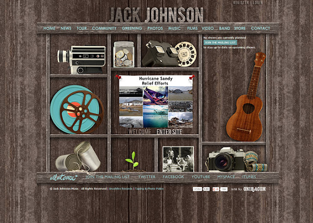
Moving on to the website, I found this example of Jack Johnson's website wich I think is fun and quirky by displaying different objects. I think this would work brilliantly with 'The Elwins' image. Incorporating musical instruments highlights the organic aspect of the band. 

However, this is only the starting point the look of the website MUST be coordinated with the album artwork to create a visual unit and create an artist brands.

Read More
Powered by Blogger.