Wednesday 31 August 2016

THE ELWINS/ campaign

For the Elwins' campaign I clearly imagined something fun, light-hearted and slightly mockery. For The album's cover I imagined the band sitting on the therapist's couch (from the music video) and looking straight into the camera. While they are looking at the camera with board faces the rest of the room contrasts. Is displayed in the aftermaths of the rage in the music video. Paper is scattered all over the floor, lampshades have fallen over etc. Then I would like a clear font to go along the top and the bottom of the cover spelling 'So down Low' 'The Elwins' in capital while letters. IF having a photoshoot session after filming is impossible, the band sitting on the couch in front of a white background (i.e. studio) would work just as well. I think this cover would link perfectly to the video and it would give off a very rebelious vibe.

While I had this idea in mind I also decided to experiment for a bit, so that I don't get to focused and narrow-minded on this idea. These are the covers that I came up with using canva again and the internet as a resource for pictures and photographs.
I very much liked this cover, since it is extremely simple but still fun. This also allows a lot of creative freedom for the work on the website since the look can be adapted in multiple different  forms.

Within this cover I wanted to create a contrast of the muted and vintage looking photograph (which has a similar colour scheme to what I am imagining in the music video) and the bright primary colours. This gives the cover a more playful touch as well as the font does.

With this experiment, I decided to explore a much more modern and more universal look for the cover. However I still kept the stimulus of the couch to create the visual link in between the music video and the digipack.

I personally would be more than happy to develop any of these ideas.

Website

Moving on to the website, I found this example of Jack Johnson's website wich I think is fun and quirky by displaying different objects. I think this would work brilliantly with 'The Elwins' image. Incorporating musical instruments highlights the organic aspect of the band. 

However, this is only the starting point the look of the website MUST be coordinated with the album artwork to create a visual unit and create an artist brands.
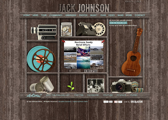
Read More

JUDAS/campaign

I developed my music video idea into a campaign concept. I decided to present Judas as an edgy, modern and international band. I chose to convey this image through a minimal style.
I used the website 'canva' to create an example of what I could imagine the campaign's look to be like.
 This is a layout of a digipack with the two inside sections placed on the furthest left and right, so they can be folded in. 

 This is the rough idea of a potential album cover of the Judas' album. I decided to use black and white as a base, to tie it in with the style of the music video and create a visual unit, by presenting the band's work in black and white. However to catch the audience's attention I added the colour red to the design. The phone creates the link to the concept of the video, in which the same phone accrues. Also, the red colour connotes desire which is the main theme of the song.

If we were to develop this cover art, I imagined another possibility in which the earpiece of the phone is simply hanging into the frame. This could be a photograph. I don't think that the band needs to be visible on the front of the digipack, since it is an organic band and this minimal look, draws all the attention to the music.

This is the back side of the digipack, with the tracklist.

This is the inside of the cover. I reused the arrow like shape to create a balanced look. Also using geometric forms gives the album a very modern and urban look, this appeals to a wide audience. By using a picture of the band, the audience is introduced more clearly to the artists and might feel more 'personally' connected to the organic artists.

I designed the digipack to be a cardboard pack, in which the CD id inserted sideways and this is the according side. Although I changed the triangular shape I continued using the same colour scheme and geometric forms to create this CD image.

WEBSITE

To complete the campaign I looked into creating a website for Judas.
First of all I had a look at their official website. Which is extremely simple. However clearly makes the band's relationship to the audience priority by gist showing tour dates and forms of staying updated on their music journey via social media. 

 Looking at the band's official web page, gave me confidence on aiming for a sleek and minimal look.

I then searched for some inspiration and stumbled over these to websites, with very fitting layouts.
 I very much like how the audience is immediately introduced to the artist and the music by having a selection of videos on them homescreen.
However once we create our own website we will only have one music video available so this is a more approachable layout. I also think the social media columns on the right are a great idea, to make the contact to the artist easily available. 

For the website I would like to have:

  • A black and white color scheme, with some red highlights, perhaps thin outlines etc.
  • incorporate geometric forms, if possible circles.
  • have the music video available on the home screen.
  • incorporate a social media column.
  • include pictures of the band.


Read More

Tuesday 30 August 2016

Video Idea 3

The Artist
This is a short video I created to introduce LÃ¥psley and her image:

Genres: Electronic, ambient, alternative R&B

The Song

The song 'Hurt Me' is available in both an acoustic (live) version and the original, techno inspired recording. I personally would prefer to work with the acoustic version since it fits better with the video concept, however this point needs further development. 


Video concept
Within the video the artist is the only character so that all the focus is on her as a solo artist.
The video is shot with a black background and dim lighting. During the performance element the artist is lit by a spotlight. To create a variety of shots, we could experiment with the different lighting and use profile shots of her siluet etc. Also, the lighting will allow us to create a hazy and soft cinematographic  look. The performance element is accompanied by a series of cut aways. The cutaways show a variety of  flowers falling onto the ground and 'breaking', this could be edited in slow motion during postproduction, to make it more dramatic. Another cutaway might show a framed picture of the couple falling onto the ground. I would also like to include a shot of a rose that is leaking blood. The flowers and the bleeding/ breaking highlights the painfull romance that the artist is singing about. The third point of interest within the video is a performance element of the artist playing the piano. 

This video concept supports the artist's image by focusing on her and connoting that she produces her own music (singer, songwriter)  by showing her playing the piano. Also by staging her in a dark room and using beautiful lighting she is presented as  beautiful and inspiring to the audience.

HAVE A LOOK AT MY MOODBOARD

A visual inspiration for the feel of the video was Adele's video to 'Send my love'


Read More

Monday 29 August 2016

Video Idea 2

The Band

For my second Idea, I chose to use music by the quirky and youthful Canadian band 'The Elwins'. They have been active ever since 2006, producing indie rock and surf pop music. The four members present themselves as upbeat, original and modern. 

This image is constructed by:

1. On their website, one can find a lof of bright colours.

2. Also through smiling on the images connotes a positive and friendly image.

3. They also construct them selfs as an organic band, which is connoted by them not beeing on their album art neither beeing the main point of interest in their music videos, the concept is of higher relevance.

album artwork
example videos

The song


The concept
For this video I imagined a surreal therapist session that spirals out of control. The video would start with the lead singer lying on a therapist's couch, once he sits upright he starts singing. Throughout the video the other band members slowly enter the room one by one to join the vocalist. The therapist tries to calm them, however it tunes into a back and forth mockery between the band and her. To keep it interesting another character is introduced in the second half of the video, which is the secretary who enters to check due to the noise. Towards the end the band vandalises the office. (eg. jumping on the couch, throwing over bookshelves etc.) A possible end to the clip could be the band sitting on the couch with the two staff members tied up on the floor.

While this video is a bit more rebellious than the band's original image, the video concept fits in perfectly with the song's lyrics. The lyrics go:
"So down low
I've been getting so down low
I've been getting deeper and down until everything's underground you know"

The Style
For the Style of the video I am Imagining a slightly hazy however comical look. 
As inspiration for the colour scheme I imagine something similar to this video of the band's performance:


Since the video is set in one location, through editing the performance element and narrative element are altered according to the beat. An example of a different genre, however similar concept is one Direction's music video to 'Best Song Ever. '

I selected a few clips as an example: 
Read More

Saturday 27 August 2016

Video Idea 1

Read More
Powered by Blogger.