Friday 25 September 2015

Practical lesson no. 2

In yesterdays (24.09.2015) 
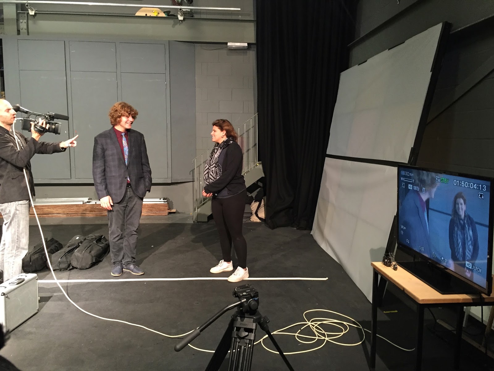
practical media lesson we were introduced to the 180 degree rule and filmed a short sequence of Katie entering, sitting down, checking her phone and exiting the shot.

The 180 degree rule is a method used to protect the audiences orientation. It is important that all the objects in a sequence stay in the same area of the shots, since the audience does not have general overview of the location. The characters or main objects in a sequence are connected by an imaginary line ( axis), which is not meant to be crossed while filming. The rule says that the camera is allowed to switch positions on one side of the line, with in 180 degrees.

As we begun to shot our sequence we also learnt about the job of the director and about how important continuity is. In our sequence we first started with an wide angle shot, which is always required as a back up shot in case something goes wrong. Next up we shot a close up of the phone on the arm of the chair, followed by a midi shot of Katie, a close up of her face and a high to low shot of her checking her phone.While shooting these shots we always had to refocus the camera, bubble
and reposition it.

Continuity is the consistency of objects in a shot. It is a very important aspect, to avoid that the final edited sequence comes out in a strange way. 

While shooting, the dialogue is set to follow this layout:
director: "stand by"
cameraman/women: "standing by"
director: "camera roll"
cameraman/women: " camera rolling"
director: "action"
-scene-
director: "cut"

Read More

Poster analysis


The bold Film poster to the movie ‘Red’ uses multiple cases of mise-en–Scene and other vehicles to connote ideas.

The main color featured in the poster is red, which has a connotation of aggression, blood and danger. Also, the color repeats and emphasizes the title. The feelings and thoughts we connect with the color red are all definite trademarks of an action film, which is defined as “a genre wherein physical action takes precedence in the storytelling. The film will often have continuous motion and action including physical stunts, chases, fights, battles, and races. The story usually revolves around a hero that has a goal, but is facing incredible odds to obtain it.“ 

The Poster designers made sure that the audience is aware of the film being action themed, by incorporating mise-en-scene props like the guns, ranging in sizes, and presenting them in an actively used way. Also an ‘unfeminine’ font was used to catch the male audience’s attention. The Font is bold, simple and presented against a black background, which again the contrast of Red and black creates a connotation of danger and death.

As a persuasive technique to attract an audience, the producers of the poster used the famous actors and their genre label they are famous for. The list of the celebrity cast is located horizontally along the top of the poster; listing stars like: Bruce Willis, Morgan Freeman, John Malkovich, Mary-Louise Parker and Helen Mirren. This provides the viewer with trust in what quality and what type of film they are dealing with. The actors are used as USPs, by displaying their names and huge prints of their close ups.

The poster introduces the main character by portraying them photographically, with strong facial expressions that makes the viewers project the stereotypical characteristics, related to the genre, onto the characters crating outlines of their personalities and their fore of the style and tone of the film.

The primary messages conveyed by the poster are verbal since the poster reads the catch phrase: ”STILL ARMED. STILL DANGEROUS. STILL GOT IT.”  The phrase indicates that the characters featured in the movie are of a certain age and professionals in their professions. Another nonverbal but visual aspect of the poster is the way the characters are placed in the for and background, their spacing indicates their importance in the film.

Another effect the actors have on the film poster is to express how big the budget of the movie was and therefor what quality can be expected. This is simply another way to comfort the audience, since the viewers enjoy knowing what to expect before seeing the movie. Displaying the production company creates the same effect.

The poster also displays the date of release, which is obviously an important piece of information; in this case it is the 15th of October.


I personally think it is a simple, however well planed poster; fulfilling the desired effect of stating the genre and attracting the according audience. I find it to have a very powerful and well-composed use of colour and its connotations, which is one of the main attention hookers. Also I like how it is sectioned of into three segments, to allow the display of different illustrations and characters.
Read More

Wednesday 23 September 2015

Practical lesson in The Hurtwood Film studio

Our class had their first practical lesson on Thursday  the 17th of September.
We were introduced to the Film studio and to the basic rules of working there.
Working with three cameras we got to explore focusing, white balance, usage of a tripod, balancing the camera out and changing the camera lens. Of course we were also taught some rough ideas of when the different types of cameras are used and how a tilting shot or panoramic shot are composed.


 I was working with the Sony HXR-NX5 Camcorder NTS, which I experienced to be a very interesting,  yet a heavy Camera. In fact it was so heavy that the 'yours & mine rule' introduced to us seemed very reasonable. The rule encounters that when you hand over an expensive object you say "your's" as soon as it leaves your hand and say "mine" as soon as you receive an object and feel that you hold on to its weight appropriately, to reduce the amount of casualties. 

We learned how to change the cameras batteries, by sliding the battery up and down and how to focus on an object. To focus you need to zoom in as far as possible and than focus on the target object by adjusting turning the according, fragile focusing ring attached to the camera's lens. However, the process is completely different with the Canon 5D were you have to measure the distance separating the camera from the object and then adjust the focusing ring, which displays the distance in the Customary units.


Setting up the tripod we were informed that it is important to start by stabilizing the base first and then extending it into the vertical direction, before attaching the camera on to it. The camera is simply slide on to the Camera holder by pressing down a button and letting the camera click into place. An important step to take is the balancing of the Camera, by slightly  unscrewing the  
handle bellow the camera and making sure that the provided helping bubble is in the outlined circle, to get an even and straight image.

Another thing we touched upon, is how to adjust the white balance.  The process consists of zooming into a white surface and setting the white balance on it, simply by pressing the button, however the setting will have to be changed when the lighting changes from interior to exterior. 


Read More

Tuesday 15 September 2015

Semiotics

In Today's Media class we discussed semiotics, in particular the two basic methods 'Connotation' and 'Denotation'.  Denotation referring to the visual objects that we can see and Connotation referring to  the meaning of a sign that is arrived through cultural experiences by the audience. Some connotations to places, people and objects (etc.) have a universally associated meaning for many people and then others have a very personal associated connotation depending on our experiences. An Example of a universal connotation is the image of a female  in response to the color pink and he image of a male in response to the color blue.

Here are a few more universal or 'stereotypical' connotations:


 Blonde Women:

  • less intelligent
  • more desirable
  • dependent


A Pensioner:


  • grumpy
  • old
  • boring
  • chatty


A Computer Geek:

  • shy 
  • unhygienic
  • wear glasses
  • tucked in shirts, with suspenders
  • smart


An upper class person:

  • intelligent
  • well/expensively dressed
  • rich
  • snobbish

Read More

Monday 14 September 2015

How is tension created?

Blitz


Blitz is a A1 Media project created by Sophie Greig, Charlie Manton, Catherine Ward-Thomas in 2011, The thriller opening sequence is sett in Britain during the second world war.
           
The sequence create tension by:

  • Slow Camera movement
  • dim lighting
  • using radio sounds in the background, rather than music
  • not having an establishing shot, to preserve mystery 
  • providing background information in form of wall art, to get the audience pondering.


    Read More

    Opening Sequence to the Breakfast Club

    The opening sequence to
    ‘The Breakfast Club

    ‘The Breakfast Club’ is a comedy-drama produced, written and directed by the American producer John Huges, which premiered in February 1985. The film was a box office success, grossing $45,875,171 domestically and $51,525,171 worldwide. It is considered to be one of the best movies ever made and often referred to as the ’quintessential 1980s film’. The movie has a psychological background and tells the stories of different stereotypes who step out of their comfort zone and cope with basic teenage problems, like fitting into a group and identity struggle.


    I personally like the opening sequence of the film as it gives the viewer a lot of information about the setting, the characters and their backgrounds, as well as setting the tone of the film and tying the end and beginning together.

    The first thing that appears on the screen is a sky full of stars that fade out into the Universal logo along with the song ‘Don’t you’ by simple minds. The Song has a strong relation to the movie because it contains lines like: ‘won’t you come see about me? I’ll be alone,..’, ‘will you recognize me? Call my name or walk on by.’ or ‘tell me your troubles and doubts.’ The score repeats in the final scene, and consequently became the movie’s theme song.  The Logo is followed by a one minute and 44 second long credit interval, which nowadays is added to the end credits to avoid an interest loss of the audience. However, I think it is very honoring and cherishing towards the actors and filmmakers to present their names in the beginning of the project, on which they usually have been working on for two to five years.

    The interval is followed by a shot of David Bowie’s quote: “... And these children
that you spit on
as they try to change their worlds
are immune to your consultations. They're quite aware
of what they're going through...” in white letters on a black background, which is then smashed to reveal the first establishing shot of the Shermer High School. Along with the shot of Brian, one of the Main characters announces (in form of a narrator) the date, location and time. The bursting of the screen image is unexpected and therefore catches the viewer’s attention by signifying with a loud sound that the following sequence is important. While Brian explains the current situation and reads his essay directed to Mr. Vernon (the teacher), the score changes into a more silent version without lyrics and we see an ensemble of different shots from the School building.

    Firstly, we see a clock in an empty hallway followed by an empty food counter to once again enhance the feeling of an early Saturday morning. I personally feel that the effect is captured well by the shots of the empty hallway and lunch area, because all the Cubs and snack bars are perfectly stacked and displayed ready for Monday’s morning’s uproar, but the seating areas are deserted, which is a very unusual situation. Also the director played close attention to the fact that at the end of the empty hallway there is an open door revealing another empty hallway, to create the feeling of silence in the viewers mind subconsciously, since there is no sound coming from the other corridors too.

    After these establishing shots introduce the setting of the film we are provided with a sequence of shots that create a background for the characters. We get to see multiple shots of destroyed property in school, a newspaper article on the schools wrestling team, trophies, an academic classroom, a sports changing room, strange artwork in a guidance councillor’s office, a note book with ‘help’ scribbled all over the pages, an announcement banner for ‘senior spirit soars’ and the prom queen voting. All these shots enhance the stereotypical groups the students belong to. The bridge between the establishing shots and the more specific ones of the school building is created by a shot of a student store display. While all of these play Brian sets a rough plot of the film by explaining that they judged each other based on the stereotypes, but have been brainwashed during their Saturday detention.

    These introductory shots are followed by 1 minute and 44 seconds of character introduction, acting as a bridge between the opening sequence and the plot beginning. The characters are introduced through tings like the car type, their clothing, the way their parents interact with them and the way they carry themselves.

    The film fascinates me every time, due to the attention to detail and by how it still interests thousands of people although the plot is given away in the first few minutes.


    Read More
    Powered by Blogger.